Biology 5.23-5.24 - Lifestyle and disease
Explain how diet, activity, alcohol and smoking affect disease risk, then use BMI, ratios and population data to interpret health patterns without confusing correlation with causation.
Why diseases have several causes
A non-communicable disease (NCD) is not passed from one organism to another. It often develops over a long time as processes in cells, tissues and organs are affected by several influences. A risk factor is a characteristic or exposure associated with an increased probability of disease. It is not a guarantee that the disease will occur.
The influences can be grouped as:
- behavioural, such as smoking, alcohol intake, diet and physical activity;
- environmental and social, such as air pollution, food availability, income and access to safe places to exercise;
- physiological, such as high blood pressure or high blood cholesterol;
- genetic, such as inherited variants that change susceptibility.
These factors interact. For example, smoking can damage artery linings, while high blood pressure places extra stress on the same vessels. An inherited tendency to high blood cholesterol can add another risk. The combined probability of cardiovascular disease can therefore be greater than it would be with only one factor.
| Disease group named in this lesson | Examples of interacting factors | What the interaction can change |
|---|---|---|
| Cardiovascular diseases | smoking, inactivity, diet, blood pressure, blood cholesterol, inherited susceptibility | the probability that arteries narrow or become blocked |
| Many forms of cancer | tobacco smoke or other environmental exposures, age and inherited susceptibility | the probability that cell-cycle control is disrupted |
| Some lung diseases | smoking, polluted air and inherited susceptibility | the amount of long-term damage to lung tissue |
| Some liver diseases | alcohol exposure, obesity, existing liver disease and inherited susceptibility | the amount of liver-cell damage and scarring |
| Diseases influenced by nutrition | the amount and balance of nutrients, activity, illness, food access and genetics | the probability of obesity, undernutrition or a deficiency |
Two people with one risk factor can have different outcomes because their other factors differ. Equally, a person with no obvious behavioural risk can still develop disease. Use increases risk rather than the deterministic phrase causes every case.
Population data may show that a risk factor and disease occur together. That correlation is useful evidence, but it does not by itself prove that the factor caused the disease: another variable may influence both. A plausible biological mechanism and evidence from several kinds of study make a causal explanation stronger.
Diet, exercise and nutrition
Food transfers both energy and nutrients to the body. Physical activity increases energy use. When energy intake is greater than energy use over a sustained period, the surplus is stored, much of it as fat. Continued fat storage can increase body mass and lead to obesity. Low physical activity reduces energy expenditure, so it can contribute to the same positive energy balance.
This is a risk mechanism, not a judgement about a person. Genes, medicines, illness, income, food availability and opportunities for exercise can all affect energy intake, energy use and body mass. Diet and activity therefore interact with biological and environmental factors.
Malnutrition
Malnutrition means poor health caused by too little, too much or an unsuitable balance of nutrients. Undernutrition is one form; overnutrition is another.
In undernutrition, too little energy, protein or particular micronutrients reach the body. Cells then have insufficient fuel or raw materials, so growth, tissue repair and immune function may be impaired. A diet can also provide enough energy but too little of a particular nutrient, producing a deficiency. If exercise increases energy use while food intake remains insufficient, the energy deficit can become greater. By contrast, a diet that repeatedly supplies more energy than is used can contribute to obesity. A varied, balanced diet helps avoid both extremes.
Regular exercise uses energy and helps maintain cardiovascular fitness. However, exercise does not cancel any amount or composition of food, and one meal or one inactive day does not by itself create a long-term disease. The important pattern is sustained exposure over time, interacting with other factors.
BMI and waist:hip ratio
Body mass index (BMI) relates an adult's mass to the square of their height. It is an indicator that can help compare body mass with height, not a direct measurement of fat or a complete assessment of health. A muscular person can have a high BMI because BMI cannot distinguish muscle from fat. Interpreting an individual's health needs more information.
Body mass index
The unit is . Convert height to metres before squaring it.
Worked example: BMI
For mass and height :
- Convert height: .
- Square the height: .
- Divide mass by height squared: .
- Round at the end: to 3 significant figures.
Using in the equation gives a much too small value; dividing by without squaring gives a different, incorrect quantity. Keep the full calculator value until the final step.
Waist:hip ratio compares the waist circumference with the hip circumference and gives information about where body fat is distributed. Use the same unit for both measurements:
Waist:hip ratio
The units cancel, so the ratio has no unit.
For a waist of and hips of :
The answer is less than 1 because the waist is smaller than the hips. A larger ratio generally indicates more fat around the waist, but this ratio also does not diagnose health by itself.
Alcohol, smoking and population health
The liver processes alcohol. Cirrhosis is extensive scarring of liver tissue. Repeated high alcohol exposure can cause fat to accumulate in liver cells and can damage those cells. Continued damage may produce inflammation and then scar tissue; extensive scarring reduces normal liver function. Risk rises with exposure, but alcohol interacts with other factors such as obesity, existing liver disease and inherited susceptibility, so outcomes differ between people.
Smoking affects cardiovascular disease through more than one route:
- Chemicals in tobacco smoke damage the lining of coronary arteries, encouraging atheroma, a fatty deposit, to develop in the wall.
- The artery lumen becomes narrower, so less blood can reach heart muscle.
- Carbon monoxide reduces the amount of oxygen that haemoglobin can carry, while nicotine increases heart rate and places extra demand on the heart.
- Smoking also increases the risk of a blood clot. A clot can block an already narrowed coronary artery.
- Reduced oxygen delivery to heart muscle can damage the tissue and cause a heart attack.
This chain explains why smoking increases risk, but it still does not mean that every smoker will develop cardiovascular disease or that every non-smoker is protected.
The same biological mechanisms operate at different population scales. What changes is the number of people exposed, the conditions shaping exposure and the size of the resulting burden.
| Scale | How lifestyle factors have an effect |
|---|---|
| Local | If smoking, inactivity, harmful drinking or poor access to balanced food is common in a community, more local people may be exposed and local rates of CVD, liver disease, obesity or malnutrition may rise. Local health services then face greater demand. |
| National | Local patterns combine across a country. Widespread exposure can increase hospital treatment, long-term care and loss of healthy working life, while national policies and services can change exposure for millions of people. |
| Global | Tobacco use, unhealthy diet, inactivity and harmful alcohol use contribute to NCDs worldwide. Exposure and access to prevention or treatment differ between countries, so the burden is uneven even though the risk mechanisms are shared. |
When comparing places, use rates rather than raw case numbers where population sizes differ. An observed difference may support an association, but age, income, healthcare access and other variables must be considered before claiming one lifestyle factor caused the whole difference.
Collecting and presenting health data
A sample is the subset of a population measured in a study. To estimate a community's health fairly, recruit people who represent that community rather than only people at a gym or hospital. Random selection can reduce selection bias; a larger sample reduces the effect of unusual individuals but does not remove systematic bias. Use the same measurement method, record missing data, and compare similar age groups when age could affect the outcome.
Averages summarise a sample in different ways. In an invented sample, five adults report daily walking times of minutes:
- The mean uses every value: minutes.
- The median is the middle value in order: minutes. With an even number of values, take the mean of the two middle values.
- The mode is the most frequent value: minutes. Some datasets have no mode or more than one mode.
The 75-minute value raises the mean, so the median better describes the central walking time for this small sample. It should not be discarded simply because it is unusual: check whether it is a genuine measurement or an error. The range, minutes, describes spread rather than an average. Choose and name the summary that answers the question, and retain the units.
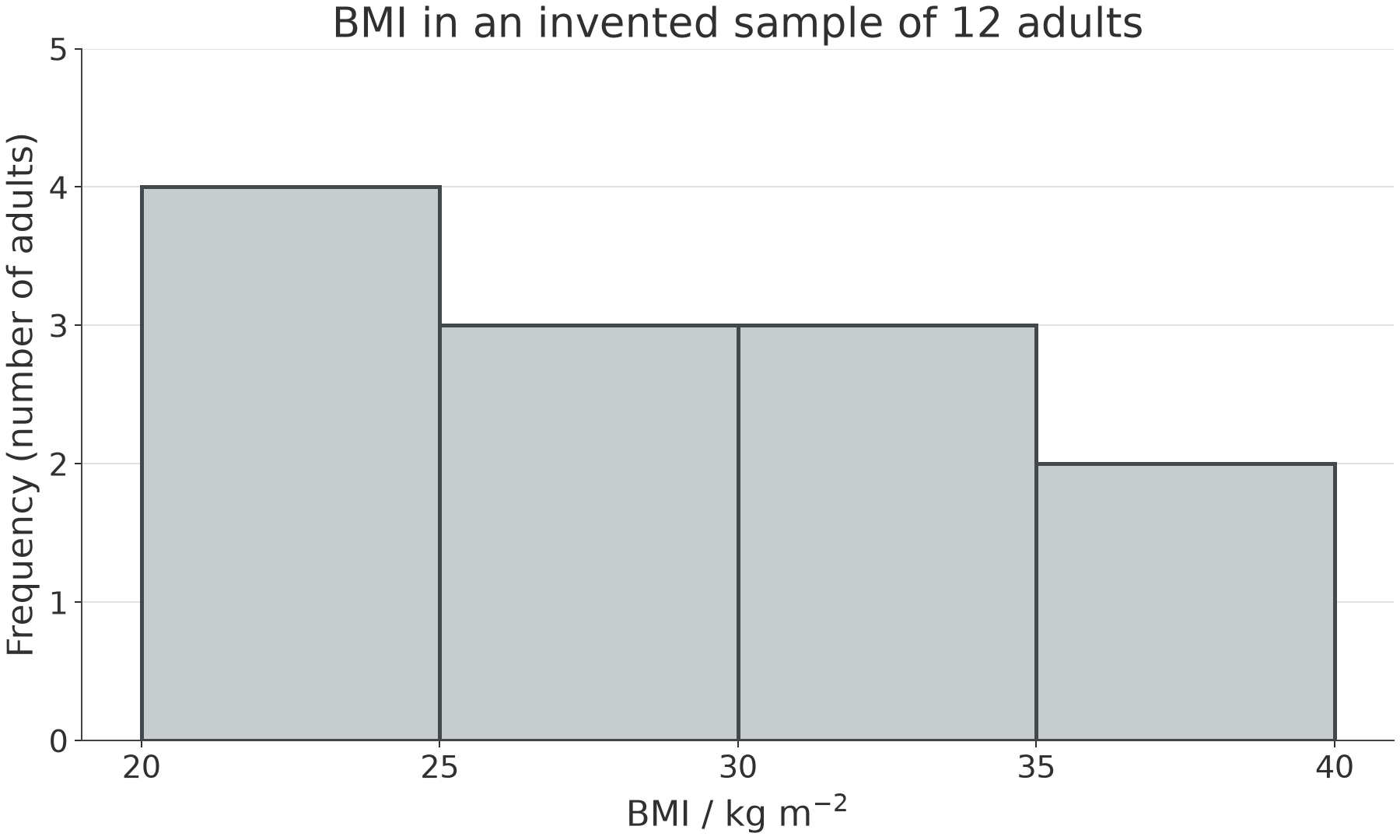
A frequency table counts observations in each group. These invented adult BMI values are in :
.
| BMI interval | Frequency |
|---|---|
| 4 | |
| 3 | |
| 3 | |
| 2 |
Count each value once, using intervals that do not overlap; for example a value of exactly 25 belongs in the second group. The frequencies add to 12, matching the sample size. These equal-width numerical intervals can be displayed in a histogram, with touching bars. With equal widths, bar heights can show frequency directly. A bar chart instead compares separate categories and its bars have gaps. For example, for 8 current smokers, 6 former smokers and 16 never-smokers, put the three categories on the horizontal axis and frequency on the vertical axis; draw equal-width bars to heights 8, 6 and 16 on the same scale. If histogram intervals have unequal widths, use frequency density (frequency divided by class width), so bar area represents frequency.
[DIAGRAM: asset_slug: biology_5_24_health_data_histogram; description: Equal-width BMI histogram for the 12 supplied values: bins 20-25, 25-30, 30-35 and 35-40 have frequencies 4, 3, 3 and 2; bars touch.]
Choose a graph that matches the question:
- For a change in cases over time, put time on the horizontal axis and cases or a population-adjusted rate on the vertical axis. Plot each pair accurately on evenly spaced scales, label quantities and units, and join points in time order to show the trend. A steeper rise means cases increased faster over that interval.
- For a relationship between two measured variables, plot one pair per person or area on a scatter diagram. Do not join points in collection order. A trend rising from left to right shows positive correlation; a falling trend shows negative correlation; a scattered cloud may show no clear correlation.
In the invented data below, each point represents an area. More smoking is associated with a higher annual cardiovascular disease (CVD) rate. Draw a line of best fit through the trend rather than connecting the individual areas. It summarises the pattern, not a rule obeyed by every point.
[DIAGRAM: asset_slug: biology_5_24_smoking_cvd_scatter; description: Scatter diagram of six invented area-level pairs of smoking percentage and annual CVD rate, showing a positive correlation with a best-fit line.]
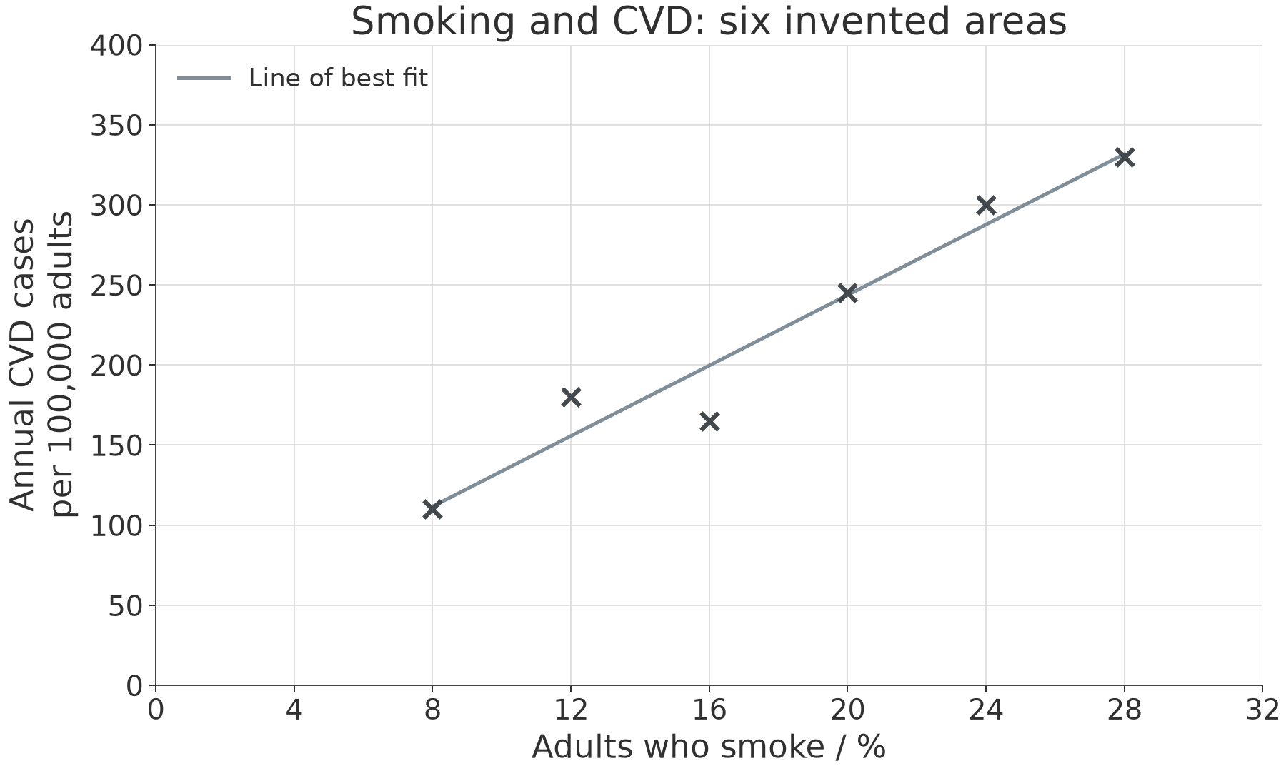
Correlation alone does not prove causation. Areas could differ in age, deprivation, healthcare access, diet or other exposures. An area-level association also does not tell us which individuals developed disease. Evidence is stronger when comparisons address alternative explanations and agree with a biological mechanism.
Rates allow comparisons between different population sizes:
If 30 new cases occur among 20,000 adults in one year, the rate is per adults per year. Compare the same time period and population definition in every area. A country with more people may have more cases while still having a lower rate.