3.1.5.2 - Maxwell-Boltzmann Distribution
In a gas, particles do not all move with the same speed, so they do not all have the same kinetic energy. A Maxwell-Boltzmann distribution shows how those energies are spread across a sample. In this lesson, you will learn how to sketch the curve correctly and how changing temperature changes what the curve tells you about particles with enough energy to react.
Reading the distribution
The key idea is that a gas contains a spread of energies, not one single energy shared by every particle.
Maxwell-Boltzmann distribution
A graph showing how the energies of particles are distributed in a sample of gas at a particular temperature.
On a Maxwell-Boltzmann graph, the x-axis is energy and the y-axis is the number of molecules, or the fraction of molecules, with that energy. The curve starts at the origin because no particles have exactly zero energy. It then rises to a peak and falls away in a long tail to the right.
The diagram below shows the standard shape of a Maxwell-Boltzmann distribution for a fixed sample of gas at one temperature.
[DIAGRAM: asset_name: 1.5.2 - Maxwell-Boltzmann Distribution - Diagram 1; asset_slug: 1.5.2 - Maxwell-Boltzmann Distribution - Diagram 1; recommended_method: retained_png; description: Exam-clean monochrome Maxwell-Boltzmann distribution graph for one gas sample at one temperature; 16:9 landscape; x-axis labelled Energy; y-axis labelled Number of molecules; one smooth curve starting at the origin, rising to a single peak at intermediate energy, then falling with a long tail to the right; thin leader line from the peak to the label Most probable energy; whole area under the curve lightly shaded and labelled Total area = total number of molecules.]
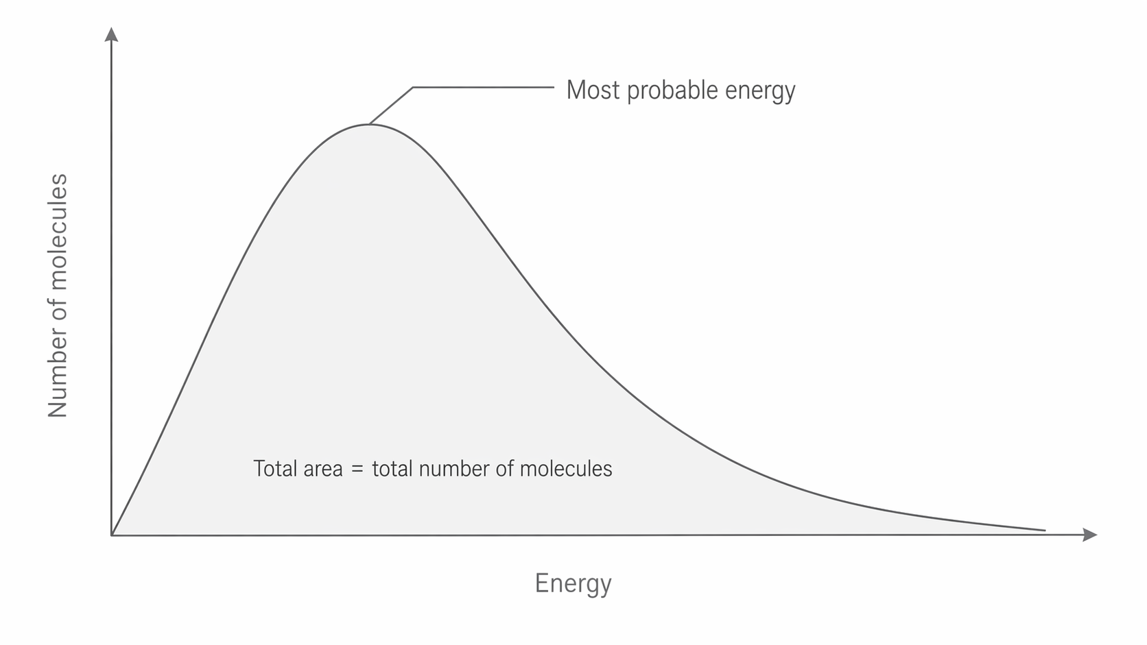
The peak marks the most probable energy, which is the energy value possessed by the largest number of molecules. That is not the same thing as the average energy. Most molecules have intermediate energies, very few have very low energies, and very few have very high energies.
Another essential feature is the area under the curve. For a fixed amount of gas, this area stays constant because it represents the total number of molecules in the sample. If the shape changes, the molecules are being redistributed across energy values, not added or removed.
Temperature and activation energy
To interpret the curve in reactions, we often compare it with the activation energy for a particular reaction.
Activation energy
The minimum energy that colliding particles must have for a reaction to occur.
If you draw a vertical line for the activation energy, the area under the curve to the right of that line represents the particles with enough energy to react. These are the particles that can make successful collisions.
When the temperature increases, the distribution changes shape. The peak becomes lower, the curve becomes broader, and the peak moves to the right. The total area under the curve stays the same, because the number of molecules has not changed.
The diagram below compares the same reaction at two temperatures and keeps the activation energy line fixed so the larger area beyond Ea is easy to see.
[DIAGRAM: asset_name: 1.5.2 - Maxwell-Boltzmann Distribution - Diagram 2; asset_slug: 1.5.2 - Maxwell-Boltzmann Distribution - Diagram 2; recommended_method: retained_png; description: Exam-clean monochrome comparison graph with two Maxwell-Boltzmann curves for the same gas sample at different temperatures; x-axis labelled Energy; y-axis labelled Number of molecules; lower-temperature curve taller and further left, labelled Low T; higher-temperature curve lower, broader, and shifted to the right, labelled High T; one fixed vertical line labelled Ea slightly to the right of the curve intersection; small shaded region to the right of Ea under the low-temperature curve and a much larger shaded region to the right of Ea under the high-temperature curve.]
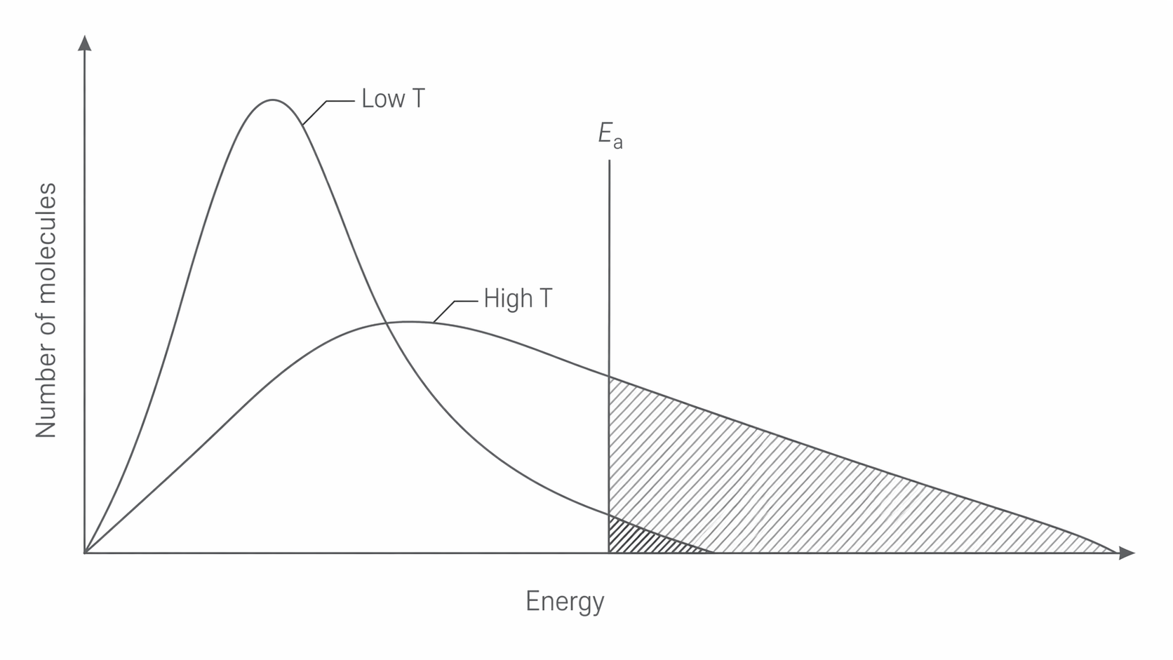
This matters because the area to the right of the activation energy line increases noticeably at higher temperature. Even a small rise in temperature can produce a much larger number of molecules with energy equal to or greater than the activation energy. That is why reaction rate increases strongly with temperature: a bigger fraction of collisions now has enough energy to react.
The activation energy itself does not change just because the temperature changes. If you are comparing the same reaction at two temperatures, the Ea line should stay in the same place. What changes is the shape of the distribution and therefore the proportion of particles beyond that line.
Drawing and interpreting curves
Drawing and interpreting these curves means sketching the shape accurately and then explaining what the shape tells you. Saying only "particles have more energy" misses the important point. A clearer explanation describes how the curve changes and links that change to the number of particles above the activation energy.
To draw the curve for a higher temperature, make sure you:
- keep the same axes labels
- keep the total area under the curve the same
- draw the peak lower
- place the peak further to the right
- make the curve broader with a longer spread of high-energy molecules
If an activation energy line is shown for the same reaction, keep it in the same position. The higher-temperature curve should then show a larger area to the right of that line.
Common drawing errors make the graph chemically misleading. Do not draw the higher-temperature curve with a taller peak. Do not change the total area under the curve. Do not move the activation energy line just because temperature has changed. Do not make the curve stop suddenly; it should tail off gradually to the right.
One useful way to interpret any Maxwell-Boltzmann graph is to ask three questions in order. What do the axes represent? How has the shape changed? What does that change tell me about the proportion of particles with enough energy for reaction? That sequence keeps your explanation precise and tied to the chemistry.