1.1.3 - Analysing experimental data
Experimental physics does not finish when the apparatus is switched off. The readings have to be processed, displayed, and interpreted so that a conclusion follows from the evidence rather than from wishful thinking. In this lesson you will practise the OCR analysis skills behind almost every practical question: using sensible significant figures, plotting useful graphs, measuring gradients and intercepts, and using uncertainty information carefully when it affects a conclusion.
From Results To Conclusions
Analysis is the stage where raw observations become evidence. A raw result is what was read or observed directly: a stopwatch reading, a voltmeter reading, a measurement on a ruler, or a qualitative observation such as "the oscillations became smaller". A processed result is obtained from raw results: a mean, a calculated value, a graph coordinate, a gradient, an intercept, or a comparison.
Qualitative Result
A qualitative result describes a quality or behaviour without a numerical value, such as a colour change, the direction of a trend, or whether a signal is present.
Quantitative Result
A quantitative result contains numerical data with units, such as a length of 0.452 m, a current of 0.180 A, or a gradient of 3.2 N m^-1.
Good analysis keeps those two types of evidence separate. A statement such as "the line goes up" is qualitative. A statement such as "the gradient is 1.8 m s^-1" is quantitative. OCR questions often require both: the numerical processing gives a value, and the interpretation explains what that value means.
A useful analysis route is:
- Record the raw readings with units and consistent precision.
- Process the readings using the correct mathematical operation.
- Look for a pattern, relationship, gradient, intercept, or comparison.
- State a conclusion that follows from the processed evidence.
The conclusion must be valid for the data you actually have. If the processed values show an increasing straight-line trend, it is fair to say the dependent variable increases linearly with the independent variable over the tested range. It is not fair to claim the same relationship for all possible values unless you have a model and evidence for that wider claim.
Mean Of Repeated Readings
Here, x_1, x_2, ... are repeated readings of the same quantity and n is the number of readings. Repeats reveal the spread and possible anomalies, so the precision and repeatability of the measurements can be assessed. When the variation is random, the mean gives a better estimate because high and low fluctuations tend to offset; it does not remove systematic error. Later evaluation lessons deal more fully with anomalies and confidence in conclusions; here the focus is on processing and interpreting the data.
Worked example: processing repeated readings
A student measures the time for one event three times:
1.18 s, 1.21 s, 1.19 s
The mean time is
The raw times were recorded to 0.01 s, so a sensible processed value is
The analysis does not stop at the arithmetic. A valid conclusion would be something like: "For this set of repeats, the best estimate of the time is 1.19 s." It would be too strong to say the exact time is 1.193333... s, because the apparatus and repeated readings do not justify that precision.
Significant Figures
Significant figures are the meaningful digits in a measured or calculated value. They are not decoration. They tell the reader how much precision the data can support.
Significant Figures
Significant figures are the digits in a number that carry information about its size and precision. Leading zeros are not significant, but zeros between non-zero digits or after a decimal point can be significant.
For example:
0.00470has three significant figures:4,7, and the final0.3.20has three significant figures.3.2has two significant figures.2.30 x 10^2clearly has three significant figures, while2.3 x 10^2has two.
OCR expects calculated results to be reported to a precision justified by the data. A calculator display is not an answer. If the least precise measured input has two significant figures, a final answer with six significant figures usually exaggerates what the experiment can support.
The most useful habits are:
- keep extra digits during intermediate working;
- round only the final answer unless the question asks otherwise;
- use standard form when a trailing zero could be ambiguous;
- give units with physical quantities;
- keep raw readings of the same quantity to a consistent number of decimal places where the apparatus allows it.
Worked example: avoiding calculator precision
A student calculates a value from
The calculator gives
The value 0.032 is quoted to two significant figures and is the least precise number in the calculation. A suitable final answer is therefore
or, if a unit is required in the context, 26 with that unit. Writing 26.4375 would imply much more precision than the measurements justify.
Be careful: this is a reporting rule for the final processed result, not permission to throw away information early. If 26.4375 is needed in a later step, keep the unrounded value in the calculator and round only the final result.
Plotting Experimental Graphs
A graph is a calculation tool, not just a picture of the data. It can show whether a relationship is linear, whether a trend is increasing or decreasing, and whether a physical value can be found from a gradient or intercept.
The usual convention is:
- put the independent variable on the horizontal axis;
- put the dependent variable on the vertical axis;
- label each axis with a quantity and a unit;
- choose a scale that uses the plotting area sensibly and is easy to read;
- plot data points accurately, usually with small crosses;
- draw a line or curve of best fit that represents the trend, not a dot-to-dot join.
Axis labels should distinguish the quantity from the unit. These are good labels:
t / sV / VL / mT^2 / s^2
These are poor labels:
secondsvoltslengthT^2
The poor labels either give only the unit or omit the unit. OCR graph marks often depend on this basic discipline.
[DIAGRAM: asset_name: Lesson 1.01.3: Analysis, graphs and uncertainties - diagram 01; asset_slug: 1_01_3_analysis_graphs_and_uncertainties__diagram_01; recommended_method: drawn_physics; description: 16:9 NovaLearn-style graph on a white background, with x-axis labelled "independent variable X / unit" and y-axis labelled "dependent variable Y / unit"; five plotted crosses with vertical error bars; a solid straight line of best fit; a dashed worst acceptable line; a large gradient triangle drawn on the best-fit line labelled rise and run; y-intercept labelled c; a small note beside the triangle saying "use points on the line, not raw data points".]
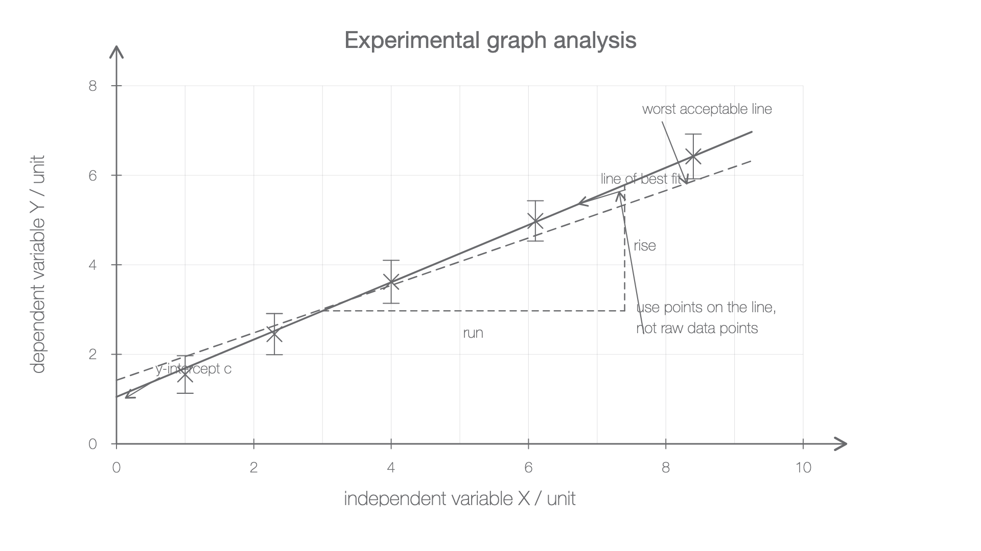
If uncertainties are supplied for plotted values, show them with error bars. An error bar is not a new data point; it shows the range within which the measured value is expected to lie according to the uncertainty information supplied. For this lesson, the key analysis idea is that error bars affect what lines of fit are acceptable and therefore what gradients and intercepts are reasonable.
Worked example: choosing axes and labels
A student changes the length L of a pendulum and calculates T^2 from measurements of the time period T. The instruction is to plot T^2 against L.
The correct axes are:
- horizontal axis:
L / m - vertical axis:
T^2 / s^2
The phrase "plot Y against X" means put Y on the vertical axis and X on the horizontal axis. The units follow from the quantities: if T is measured in seconds, then T^2 has unit s^2.
Gradients And Intercepts
Many experimental relationships can be written or rearranged into the straight-line form
Straight-Line Relationship
Here, y is the vertical-axis quantity, x is the horizontal-axis quantity, m is the gradient, and c is the vertical-axis intercept. The intercept is the value of y when x = 0, if the line can sensibly be extended to the vertical axis.
Gradient Of A Straight Line
The units of a gradient are the vertical-axis unit divided by the horizontal-axis unit. If the graph is s / m against t / s, the gradient unit is m s^-1. If the graph is F / N against x / m, the gradient unit is N m^-1.
When finding a gradient from experimental data, use two well-separated points on the line of best fit. Do not simply choose two plotted data points unless they happen to lie exactly on the fitted line. A large gradient triangle reduces the percentage uncertainty in reading the coordinates.
Worked example: gradient and intercept from a fitted line
A graph of s / m against t / s has a straight line of best fit. Two points on the line are:
(t, s) = (0.20 s, 0.54 m)(t, s) = (0.90 s, 1.80 m)
The gradient is
To find the intercept, use y = mx + c, so
Using the first point on the line:
The gradient has units m s^-1 because it is a change in distance divided by a change in time. The intercept has units m because it is a value on the vertical axis.
Uncertainty-Aware Analysis
Uncertainty-aware analysis means using the precision of the data honestly when you calculate and conclude. This lesson only needs the analysis side: significant figures, error bars where supplied, and the effect of best-fit and worst-fit lines on gradients or intercepts. A later evaluation lesson deals more fully with precision, accuracy, limitations and improvements.
Line Of Best Fit
A line of best fit is the straight line or smooth curve that represents the overall trend in the plotted data.
Worst Acceptable Line
A worst acceptable line is an extreme line that is still reasonable for the plotted data and uncertainty bars. It is used to estimate the uncertainty in a gradient or intercept found from a graph.
If a graph has a best-fit line and a worst acceptable line, an OCR-style estimate of uncertainty in the gradient is often found from the difference between the two gradient values:
Gradient Uncertainty From Best And Worst Lines
Similarly, an uncertainty in an intercept can be estimated from the difference between the intercept from the best-fit line and the intercept from the worst acceptable line:
The uncertainty should be quoted as a positive value. The final value and the uncertainty should be presented with compatible precision. For example, 1.82 +/- 0.14 uses the same decimal place for the central value and the absolute uncertainty.
Worked example: using a worst acceptable line
A graph gives:
- best-fit gradient
m_best = 1.82 m s^-1 - worst acceptable gradient
m_worst = 1.68 m s^-1
The uncertainty in the gradient is
So the gradient can be reported as
This means the graph analysis supports a range from about 1.68 m s^-1 to 1.96 m s^-1. If an accepted value of 1.75 m s^-1 is being compared with the result, it is consistent with this graph result. If the accepted value were 2.20 m s^-1, it would not be consistent with this uncertainty range.
Notice the boundary of the claim. A good conclusion is not "the accepted value is definitely correct". A better conclusion is "the accepted value is consistent with the value from the graph, within the uncertainty estimated from the best and worst acceptable lines."
Uncertainty-Aware Analysis Summary
In OCR practical analysis, a graph is useful because it turns a pattern of experimental points into a numerical gradient, intercept and conclusion. The conclusion is strongest when the axes, units, significant figures, fitted line and uncertainty treatment all match the evidence.