1.1.3 - Analysis, graphs and significant figures
This lesson is about turning practical results into evidence. You will learn how to process qualitative and quantitative results, choose sensible significant figures, draw and interpret graphs, and use gradients, intercepts and tangents to support a valid conclusion.
From Results to Conclusions
Raw observations do not become chemistry until you interpret them. A strong practical conclusion does three things: it identifies the pattern, supports it with evidence, and stays within what the data can actually show.
Valid Conclusion
A valid conclusion is a statement supported by the experimental evidence and consistent with the method used. It should not claim more precision or certainty than the data justify.
Qualitative results describe what is observed: colour changes, precipitates, gas formation, temperature changes or no visible change. Quantitative results use numbers: mass, volume, time, temperature, pH, concentration, rate or calculated values. Both types need careful processing.
Good analysis follows a sequence:
- Check what was measured and what units were used.
- Process repeated or calculated data consistently.
- Identify the pattern, trend or comparison.
- Link the pattern to the chemistry being tested.
- Write a conclusion that mentions the evidence.
Worked reasoning: a student tests three metal carbonates with dilute acid. All three fizz, and the gas turns limewater cloudy. The valid qualitative conclusion is that carbon dioxide was produced in each reaction, supporting carbonate ions being present. It would be too broad to conclude that the samples were pure carbonates unless the method had tested purity.
Processing Quantitative Data
Processing data means changing raw measurements into values that answer the practical question. This may involve differences, means, ratios, percentages, rates or formula substitution. The mathematics should be shown clearly enough that another chemist can follow it.
For repeated measurements, do not average values blindly. First check whether a value is anomalous in the context of the set. If a value is clearly inconsistent and there is a practical reason to doubt it, flag it and process the remaining comparable repeats. Detailed judgement about why it happened belongs in evaluation.
Worked example: calculating a rate from volume data
A reaction produces 42.0 cm3 of gas in the first 60.0 s.
The unit comes from the calculation: volume divided by time. This is an average rate over the first 60.0 s, not necessarily the instantaneous rate at exactly 60.0 s.
Quantitative conclusions should quote the processed value and its meaning. "The reaction is faster" is weak. "The reaction at 40 deg C has a mean gas-production rate of 0.700 cm3 s^-1, which is double the rate at 30 deg C" is much stronger if the data support it.
Significant Figures
Significant figures communicate the precision of a number. They are not decoration: too few significant figures lose useful information, while too many suggest more precision than the experiment supports.
Significant Figures
Significant figures are the meaningful digits in a measured or calculated value. Leading zeros are not significant; zeros between non-zero digits are significant; final zeros after a decimal point are significant.
Examples:
| Value | Significant figures | Why |
|---|---|---|
| 0.00450 | 3 | 4, 5 and the final 0 are meaningful |
| 12.0 | 3 | the decimal zero shows measured precision |
| 100 | ambiguous | it may mean 1, 2 or 3 significant figures unless written more clearly |
| 1.00 x 10^2 | 3 | standard form makes the precision clear |
In calculations, keep extra digits during working and round the final answer at the end. If a question asks for a specific number of significant figures, follow the instruction. If it does not, give a sensible number that matches the data, commonly the same number of significant figures as the least precise measured value used in the calculation.
Worked example: using sensible significant figures
A student calculates:
The input values are all given to three significant figures, so a sensible final answer is:
Do not round early. If 0.245 had been rounded to 0.25 at the start, the final answer would be less accurate.
Plotting Suitable Graphs
A graph is useful only if another person can read what has been plotted. Axes must be selected, labelled and scaled properly.
For a suitable graph:
- put the independent variable on the x-axis where possible
- put the dependent variable on the y-axis
- label each axis with the quantity and unit, such as
time / sorvolume of gas / cm3 - choose scales that use most of the graph area and are easy to read
- plot points accurately
- draw a best-fit straight line or smooth curve when appropriate
- do not force a line through the origin unless the chemistry and data justify it
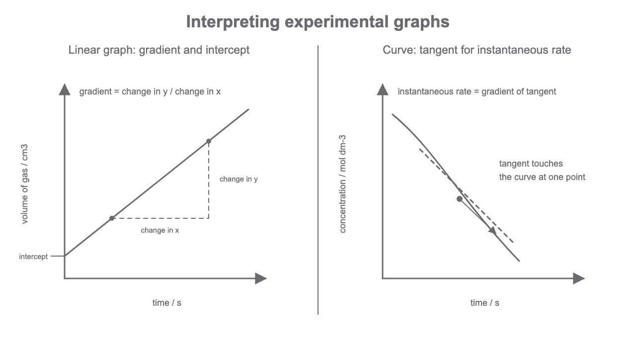
[DIAGRAM: asset_name: Lesson 1.1.3: Analysis, graphs and significant figures - diagram 01; asset_slug: 01_01_03_analysis_graphs_and_significant_figures__diagram_01; recommended_method: drawn_chem; description: NovaLearn-style graph-analysis diagram showing a linear graph with labelled axes, intercept and gradient triangle, plus a curved graph with a tangent used for instantaneous rate.]
Worked reasoning: choosing axes
If the experiment changes temperature and measures rate, temperature is the independent variable and belongs on the x-axis. Rate is the dependent variable and belongs on the y-axis. An axis label such as rate is incomplete; use the measured or calculated quantity and unit, for example rate / cm3 s^-1.
Gradients and Intercepts
For a straight-line graph, the gradient measures how much the y-value changes for each unit change in x.
Gradient
Use two well-separated points on the best-fit line, not necessarily two raw data points. Draw or imagine a large gradient triangle so small reading errors matter less. The unit of the gradient is the y-axis unit divided by the x-axis unit.
Worked example: gradient from a straight line
A graph of gas volume against time has a best-fit line passing through (20 s, 12 cm3) and (80 s, 48 cm3).
The intercept is where a line crosses an axis. In chemistry, an intercept can have a meaning only if the graph and model support it. For example, an intercept on a calibration graph may represent a background reading, but an intercept should not be overinterpreted without context.
Worked example: reading an intercept
A calibration graph has absorbance on the y-axis and concentration on the x-axis. The best-fit line crosses the y-axis at 0.020 absorbance units. The y-intercept is therefore 0.020 absorbance units. It may represent a small blank or background reading only if the method supports that interpretation; otherwise, report it as a graph feature rather than proof of a cause.
Tangents and Final Check
Curved graphs need a different method. If a curve shows how a quantity changes with time, the gradient at one point gives the instantaneous rate at that time. To estimate it, draw a tangent that just touches the curve at the point, then calculate the gradient of that tangent using two points on the tangent line.
Worked example: tangent gradient
A tangent to a curve at 40 s passes through (20 s, 30 cm3) and (70 s, 55 cm3).
That value is the estimated instantaneous rate at 40 s. It is not the average rate from 20 s to 70 s for the curve; those two points are on the tangent line used for measurement.
When you finish analysing any experimental data, ask:
- Have I processed the data needed to answer the question?
- Have I kept units throughout?
- Have I rounded the final answer sensibly?
- Does my graph have labelled axes, sensible scales and an appropriate line or curve?
- Does my conclusion quote evidence and avoid overclaiming?